Transforming Errors into User Guidance
This case study focuses on how I tackled unhappy scenarios by strategising ways to transform frustrating errors into clear, helpful guidance for users. Also ensuring the solution is easy to maintain in our backend systems, supporting both architecture and development.
*The contents of this case study have been modified to protect the privacy of EVBox. Featuring only publicly available product components, it showcases my process while preserving the confidentiality of all research and data owned by the company
Timeline
Approximately 3 months
Employer
EVBox
Role
UX/UI Designer
Sole designer on this project. I led design efforts, collaborating closely with: system architects, customer support, implementation engineers and copywriters
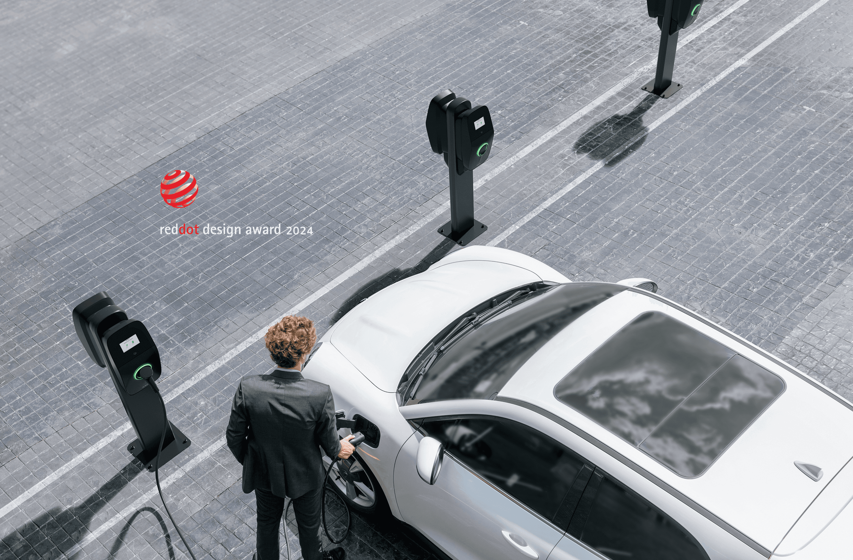
Award
The Problem
🤝 Project Dependencies & Stakeholders identified
To make sure the solution worked not only for end users, but also for the people behind the system. I collaborated closely with:
System Architects – To understand the technical language and logic behind each error.
Customer Support Teams – To identify phone guidance users received and embed it directly into the UI.
Implementation Engineers – To assess feasibility and align timelines.
Copywriting Team – To craft clear, concise, and helpful error messages.

Meet Alex our user persona:
Name: Alex
Background: EV driver – could be a commuter, traveler, or fleet driver.
Emotional State at Point of Use: Varies—could be joyful, frustrated, distracted.
Needs: Clarity, Speed, Minimal hassle.
The solution is tailored for someone on the go in public charging infrastructure, who doesn’t want to overthink an error and just wants to know what to do.
Ideation, Collaboration and Solution
Step 1: Collecting Customer Support Error Resolution Data
I reviewed support documents to understand how errors were communicated and found that users could only take four possible actions to fix them.
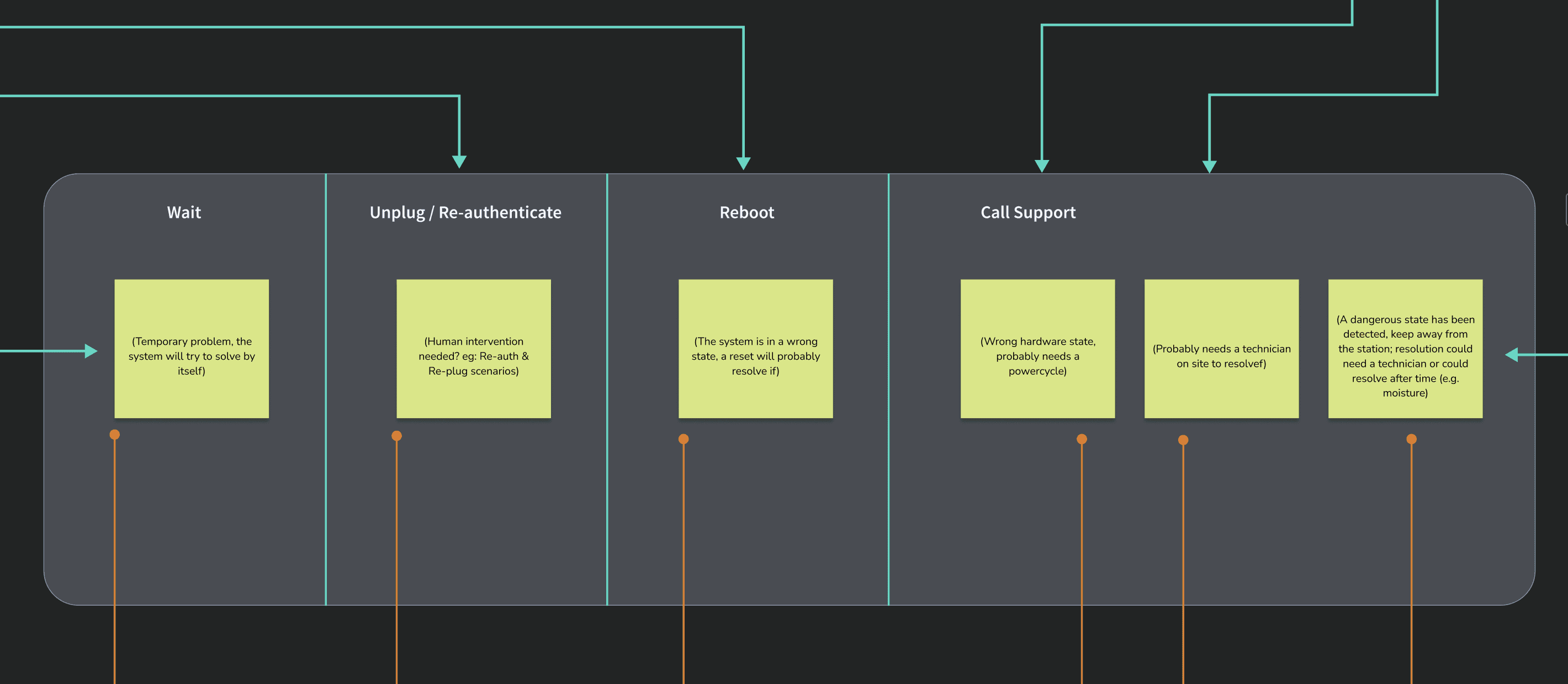
Step 2: Talking to System Architects and Linking Errors to Solution Categories Provided by Customer Support Teams
I worked with system architects to understand how errors are grouped in the system. We categorized error codes so each category clearly maps to one of the solutions provided by customer support. This way, as new errors appear with more features, we know where they fit and how to clearly guide users.

Step 3: Defining UI Patterns
I researched existing EV charging safety standards, protocols, and market UI patterns to redesign visual cues using LED colours and screen themes.
This ensured our designs were both user-friendly and fully aligned with industry safety requirements.

Summarises 24 system errors into 5 reusable UI patterns.
Helps users take action on the spot.
Used minimal, translated text and clear visuals.
100% aligns with support team guidance.
🚨 Technical Limitations I Found in the Process
The screen was non-touch and had limited space for content, so no communication could require any touch interaction.
Any text added had to be translated and maintained across markets.
Space constraints meant prioritising microcopy that supports quick decision-making.

Testing the Solution
During the testing phase:
‼️ We discovered blinking orange LED was distracting during long charging sessions.
Users found it intrusive at night, affecting drivers, garage sharers, and neighbours.

Accessibility
☀️ 🌒
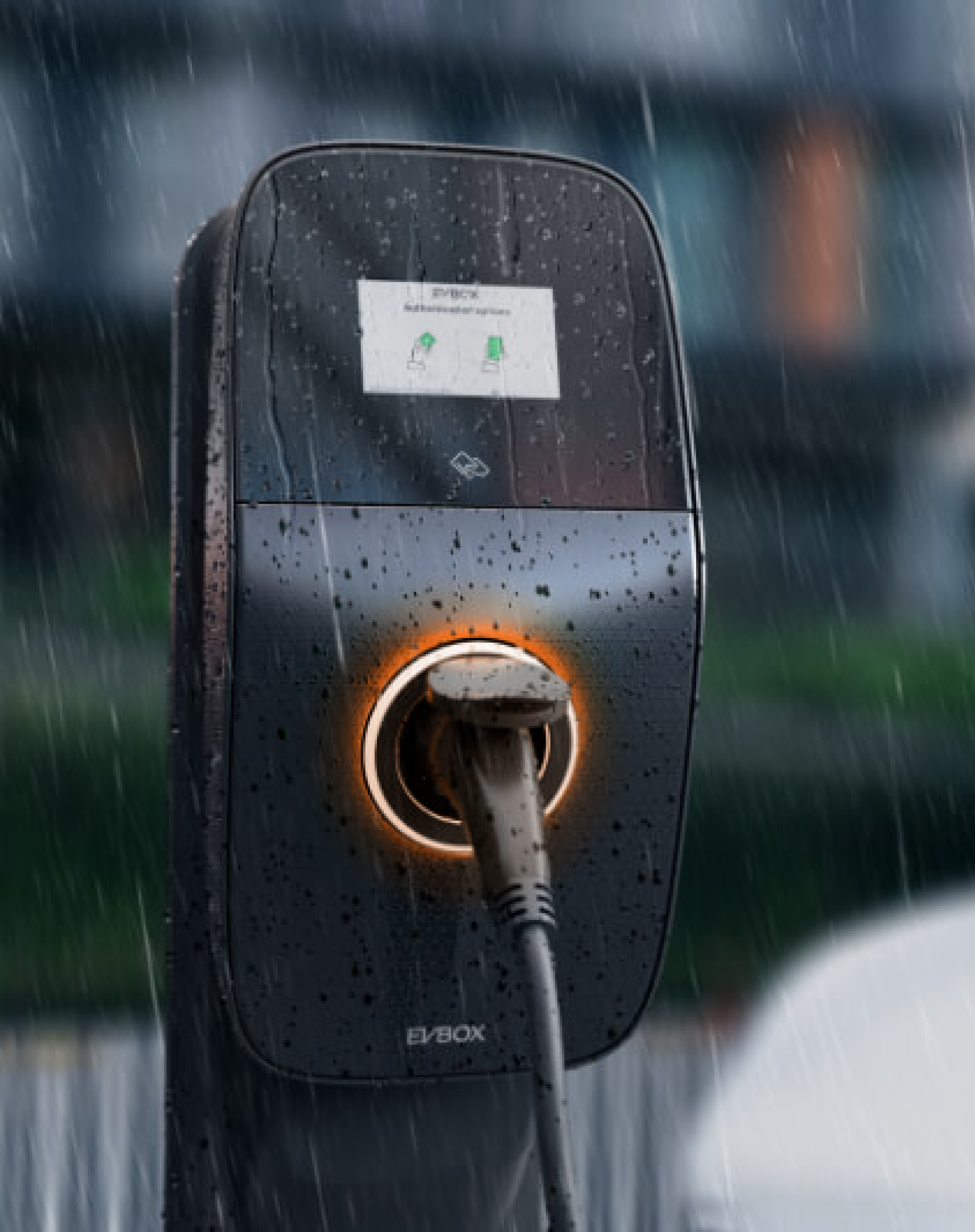
Outdoor Readability: Designed screens that are easy to see in bright sunlight and gentle on the eyes at night with adjustable brightness.
🌧️ ❄️ 🧤
Weather Resilient Interactions: Made sure the product works well in the rain and when users wear gloves.
🇺🇸 🇩🇪
Compliance: Aligned the designs with CTEP (US) and Eichrecht (Germany) rules to make sure it was ready for use in both strict EV charging markets.

What’s Next and Overall feedback
Tested Users found the visuals intuitive and instructions helpful.
Customer Support Teams reported fewer repetitive calls.
System Architects Appreciated clear mapping and reported faster issue resolution.
Engineers confirmed easy integration in upcoming versions.